Friday, 27 April 2012

Final Drawings


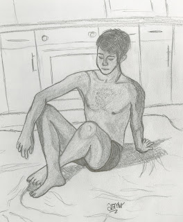
This sketch is of my friend sitting on a duvet in the kitchen. It took 1 hour. The proportions of the body are pretty much correct along with the angles of the lines. The shading around the body shows depth to the image and also where the shadows are, such as the self shadow under the arm. The shape is uses quite a closed form and a static pose. The subject is very relaxed and you can tell this by the looseness of the arm resting on the knee, there is no tension. You can see that the tension is going through the models left arm as it is very straight, this shows where the weight is. The overall anatomy is very good as you can see the outline of some of the muscles. The detail in the face and on the torso is nice as it adds more appeal to the overall drawing. The shading is especially good on the torso as it helps to define the models pecks and his bone structure around the neck. The shadow on the floor is nice as it adds more interest and creates balance. The faint background works well as it compliments the model but doesn't take focus away from it. The toes and fingers could have been drawn better, especially the fingers at the back as the hand looks in an awkward position.


This still life sketch is of a selection of items from around my bedroom. A nice composition has been used as the items have been positioned in a way that adds interest. The main focal point of this image in the elephants head and trunk and the areas of interest are the two rounded objects on top of the book. This holds the viewers attention to the image more. There are both lines and implied lines in this sketch, for example the line of the DVDs and books and then the implied line that follows around the top of the objects and around the bottom of them, leading the eye around the entirety of the drawing. There is nice balance in this picture and more than one axis for the line of balance to fall. There are some kissing objects in this picture, for example the perfume bottle and the ear of the elephant. Also the near kissing objects such as the elephant arm and the bottom of the right hand side perfume bottle, these don't work well. There are no orphaned objects for the main part of the composition, however the coins on the table could be seen as orphaned, but they are all connected by the table, placed there to help the balance. The backdrop behind is faint as to not detract the viewers attention and acts as a way of completing the picture. The shading works well overall, and you can see where the light is bouncing off some objects, the tonal values differ between darker and lighter objects, thought more could have been added plus the quality of shading could have been higher.


This landscape drawing took 43 minutes. It is of a river running down in between trees, buildings and a path. This picture shows clear perspective as the further down the eye goes the smaller everything gets. Good proportions have been used throughout as the trees are the right size and so are the buildings. This image has a foreground, a mid-ground and a background, although the mid-ground is quite hard to see in my drawing, it is very small. These three layers help to add depth to my drawing and create interest. The shading is good in places such as the river and the tress, though on the buildings they still look flat. Also the path with grass either side is fairly bad as it looks as though the whole thing is sloping when in fact only one section is. The shading has been drawn in the wrong direction. Overall this is a nice composition with a variety of things going on to look at. The top left corner has been left blank which makes the picture look fresher. The fence has been drawn well with cross-hatching to represent the wires, and the tress branched add to the depth of the picture.
Week Twelve


This sketch took 32 minutes. The location of this sketch was next to a church in Todmorden. The image focuses on the bending around of the path with a muddy, grassy slope with tress on. The different heights of the individual slopes are captured well with direction of the applied colours and the line separating the layers. The detail of colour throughout is very effective and have blended together very well. The light source is visible in parts, especially the lighter sections on the tree trunks, and top of the bend of the road. This sketch uses very nice composition as the eye can travel up the picture at ease. The fact that the tress use straight lines and everything else is curves is very effective as it creates a nice contrast. The blending of colours could be improves around the bottom left and more details could be added to improve this picture.

Tuesday, 24 April 2012

Week Eleven


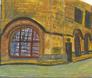
This is a colour drawing of the town hall in Centenery Square. My medium was oil pastels and they have worked well. The colours have been mixed successfully creating different tones throughout the building, the colour grey shows the darker areas well with brown and white capturing the light source. The path in front of the hall is made up of a mixture of paler colours so that it doesn't detract attention away from the main subject. The angle of the top windows are wrong and tilt too far to the right, giving the impression of a tilting wall. The perspective is good on this building and shows a 2 point perspective, two walls separated by a curved middle section. The front window works well as it looks pushed back from the frame and the wall which adds dimension and helps to create depth.


This is another pastel drawing of the town hall in Centenery Square, but this time of the front. The view angle is interesting as it is front side on creating a foreground, mid-ground and background. The colours have mixed well, with brighter colours used for the foreground. The composition of this picture works well and is interesting to look at. The curvature of the front wall is nice as it acts as a border for the picture. The three layers work well as they fade more the further back your eye gets. The proportions of each object are near correct and the coloured sketch works well. 

Week Ten


This 20 minute sketch is of a viewing box at the Alhambra theatre. The curvature of the box and the upper wall work well as they create nice symmetry and also help to portray the concept of classical architectural design. The curtain has been drawn well with a slight crease to add depth to the picture. The fact that you can see part of the upper floor and the box lower down creates a nice use of layers in the picture adding interest. There is a hint to some design features starting to take place around the bottom of the box, which would have been successful if finished. Shading would have also helped to add depth to the sketch and make it look less flat. The overall proportions are somewhat off and look too squashed in places. 


This 11 minute sketch was drawn in an old church in Germany. It shows one of the side doors and was drawn in 2B pencil.The detail in the window above the door is effective as it draws the viewers eye straight to the middle, where the main focal point is. This sketch lacks any depth at all, and looks very flat as a result. Deeper shading would have helped this problem, although it would have still looked flat. The view point is bad and the centralisation of the door does not work well as it shows boring composition. The sketch does show good balance as it is very symmetrical, and although a very rushed sketch has managed to capture the look of the church door.


This sketch has also been drawn inside the church in Germany. It took 16 minutes and I used a 2B pencil. This sketch demonstrates good perspective and the curvature of the top columns helps to follow the eye around the picture. Some detail has been put onto the top columns and the ceiling helping to add interest. The shading is not too bad, it creates depth to the sketch although would benefit from more tonal values as the picture still looks rather flat. The sketch has been drawn from an interesting view point of sitting down and looking up. There is a nice balance in the sketch and the sense of classical architecture has been portrayed well. The walls are supposed to look at an angle to each other, but looks like they are next to each other, this is a problem that I wasn't able to solve.

Week Nine


This interior landscape shows a very good use of lines. The lines are all at different angles to each other creating the shape of the landscape, there are no curves just straight angles lines making for an interesting picture. You can clearly see the architecture in the drawing with the downstairs next to the upstairs, creating a nice balance in the picture. Almost every line is in its correct place, showing a use of good proportions for the steps, walkway and wall. The empty space at the bottom of left is effective as it creates a more simplistic drawing as you cannot see what is downstairs. The overall shading has been done well, although more could have been added to give more dimension by varying tonal values as well. I used a 2B pencil and overall it is a successful, pleasing to the idea drawing.


This interior sketch took around 40 minutes to complete. The sketch focuses on perspective, as you can see the further away the viewers eye gets the longer the distance appears on the picture. The clean, clear lines and shading show modern architecture very well and uses a lot of solid lines that help to show this too. The curve works well connecting the wall to the rest of the picture. This sketch has a lot of depth and has been drawn from an interesting view point as you can see both the upstairs and the downstairs, including the front door. The angles of the lines are mostly correct and can be seen to follow the viewers eye down into the sketch, mostly the bottom middle lines of the tops of the small walls. The tonal values in the shading are varied creating interest and more depth which work well to show a 3 dimensional place on a 2 dimensional plane.


This interior sketch took 28 minutes using a 2B pencil. The sketch shows a good use of perspective, as the view point goes off down the stairs, demonstrating foreshortening. Although no stairs can be seen, the viewer can still see that the picture is of a staircase as for one the railings demonstrate, but also you can see both floors in one picture and the foreshortening shows this. This sketch looks very 3 dimensional and guides the images eye around with ease even though there aren't many curves, the eye can glide down the ceiling of the stairwell and up either wall. The shading is participially good on the wall lights as there are different tonal values throughout them creating depth and form. The shadows from the lights are also done effectively and add more interest to the overall picture.