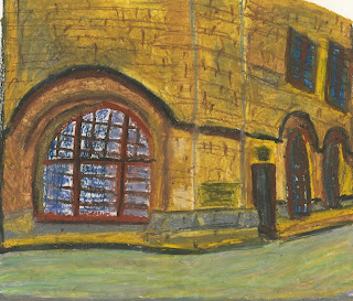
This is a colour drawing of the town hall in Centenery Square. My medium was oil pastels and they have worked well. The colours have been mixed successfully creating different tones throughout the building, the colour grey shows the darker areas well with brown and white capturing the light source. The path in front of the hall is made up of a mixture of paler colours so that it doesn't detract attention away from the main subject. The angle of the top windows are wrong and tilt too far to the right, giving the impression of a tilting wall. The perspective is good on this building and shows a 2 point perspective, two walls separated by a curved middle section. The front window works well as it looks pushed back from the frame and the wall which adds dimension and helps to create depth.
This is another pastel drawing of the town hall in Centenery Square, but this time of the front. The view angle is interesting as it is front side on creating a foreground, mid-ground and background. The colours have mixed well, with brighter colours used for the foreground. The composition of this picture works well and is interesting to look at. The curvature of the front wall is nice as it acts as a border for the picture. The three layers work well as they fade more the further back your eye gets. The proportions of each object are near correct and the coloured sketch works well.


No comments:
Post a Comment